7 Ways Data Visualization Can Improve Sales and Marketing Alignment
Table of ContentsWhat is data visualization?Types of data visualizationHow data visualization enhances sales and marketing alignment?ConclusionOrganizations routinely manage and gather a lot of data. Routinely, the sales and marketing teams of these organizations are tasked with making meanings out of the accumulated data. These teams utilize a variety of tools in transforming the accumulated data...
Table of Contents
- What is data visualization?
- Types of data visualization
- How data visualization enhances sales and marketing alignment?
- Conclusion
Organizations routinely manage and gather a lot of data. Routinely, the sales and marketing teams of these organizations are tasked with making meanings out of the accumulated data. These teams utilize a variety of tools in transforming the accumulated data into forms that summarize them as well as make them more relatable and understandable. Data Visualization can help with sales & marketing for a company in a significant way.
Traditionally, charts of different kinds are applied in transforming sales and marketing data into forms that are understandable. However, innovations in technology have broadened the available tools for summarizing and visualizing data.
What is data visualization?
Data visualization is the process of converting a large volume of data into a form that extracts the essence of the data, presenting it in a visual form. As data visualization seeks to convert data into a more relatable form, it becomes elements of art and science. As much as data visualization is powered by technology, it involves creativity to achieve a form that performs the necessary functions. Data visualization can thus be described as an added layer of abstraction of data.
The visualization of data is necessary because of the volume and form in which data is extracted. Data visualization compresses data and displays compressed data in a way that shares the meaning of the data.
Types of data visualization
Different types of data visualization are available and could be incorporated into the CRM of an organization. The application of the different types of data visualization is guided by the type and volume of data as well as the purpose of abstracting the data as certain types of data visualization is most appropriate for specific illustrations.
Geographical heatmaps
This form of data visualization is adapted for illustrating data according to location. As the name suggests, geographical heatmaps are maps of with different locations as specified spread across the map.
Identification tags are indicated for different locations. Colors are also assigned to the heat level, and this heat level could range from sales activities or other preferred activities. As the assigned activities change, the color changes across the map to indicate the activity. This type of data visualization is easy to prepare.
Waterfall charts
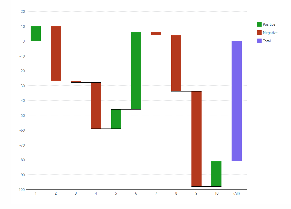
These charts are similar to traditional bar charts, which illustrate static data. Waterfall charts are adapted for illustrating dynamic data, reflecting the changes the value of interest has experienced during the period under study.
Waterfall has first and last bars which indicate where the period under observation starts and ends. In between these bars, there are indications of the changes as waterfalls.
Bubble charts
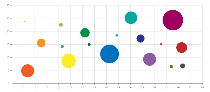
Bubble charts are charts with bubbles which indicate specific values on the chart. Bubble charts serve as a form of data visualization for illustrating the changes in the magnitude of a specific variable. Colors can be assigned to the bubbles if the data that is represented is two dimensional.
Word counts are an extension of the bubble where the value of interest is indicated with a specific word which can be counted to determine the magnitude of that value.
Gauge charts
Gauge charts indicate the gauge of a particular item. This gauge is an indication of how close the commodity is to the standard. A standard which is the goal to be achieved is usually set with the gauge indicating how near or far one is from the standard. This type of data visualization is most appropriate for visualizing the progress of a particular item towards the target.
Bullet charts, which are an extension of gauge charts, also reflect one’s progress but with bars rather than gauges.
Radar charts

Data are collected from different sources and in different forms. Data could thus include rankings with different standards. For example, certain forms of data could be graded quantitatively, while other forms of data are graded qualitatively. Presenting data that are graded quantitatively and qualitatively with the same type of visualization, thus pose a major problem. Such a problem can be resolved by utilizing radar charts.
Radar charts are thus appropriate for data with components that are not directly related. A common scale cannot be created for such data, and radar charts allow the illustration of such data.
Also Read – How Generative AI Used in Sales and Marketing
How data visualization enhances sales and marketing alignment?
The marketing and sales teams are two interconnected teams within any organization. These teams share information routinely, which could be illustrated. Data visualization technique enhances the level of interaction between the activities of both teams in the following ways.
Enhanced data integration
Data visualization tools allow the integration as sales and marketing teams across an organization utilize different tools for collecting data and carrying other regular operations. The tools applied in the marketing department of organizations typically differ from those applied across sales teams. For example, sales teams could utilize tools such as Salesforce. Marketing data, on the other hand, could come from sources that include Hubspot.
To integrate data on sales and marketing activities, data visualization is thus necessary to provide a common platform for understanding the combined impact of the accumulated. Sales and marketing efforts are an indication of the performance of an organization. The required insight from sales and marketing activities may not be gotten from the data accumulated if the data is not placed on a common platform.
When data is visualized, the overall implication of data on sales and marketing activities can be readily gotten as required. Developing patterns based on sales and marketing activities can be easily noticed when data is visualized.
With data visualization, data accumulated from different sizes can be placed on a common platform which gives the bigger picture.
Trend identification
The ways data are presented with the types of data visualization allow prompt identification of developing trends. Data visualization types like waterfall are adapted for indicating changes over specific periods: changes that can be overlooked if the data wasn’t visualized.
Data visualization also allows the diagnosis of developing trend since a detailed summary is provided. This detailed summary would reflect spikes and trends as they develop across shorter periods of time.
Instead of waiting until when a periodic analysis is carried out to discover developing trends and spikes, with data visualization, these occurrences are easily detected.
Effective communications
Data visualization generally makes data easy to understand and improves communications between teams across an organization in that way. When data from different sources are placed on a common platform, every member of the team at large will be armed with the same information, working towards the goal of the organization.
When everyone is aware of what is at stake, they would be better inspired to work towards the goal than when the source of information is more hypothetical than factual. The fact that data visualization reflects changes, as they take place also inspires team members to work towards the goal as the results of their efforts, would be visualized.
Miscommunication between the chains of command across the marketing and sales team is bound when a comprehensive form of data representation does not exist. The effect of changes will also not be readily reflected.
Data visualization is especially important for preventing miscommunications because the process of creating individual reports across the different departments is quite cumbersome. Also, these reports may make the necessary illustration and would be difficult to understand.
Prompt notifications
Data visualization serves as a dynamic way of representing data. Thus, data visualization is adapted to monitor changes as they occur and better integrate the activities of sales teams. When data visualization is incorporated into the CRM of an organization, as changes in sales and marketing activities occur, notifications are sent out to the necessary parties.
A sales manager that gets timely information is equipped to manage the sales activities of the organization strategically. For example, if the marketing teams make a breakthrough and require the sales team to move in, the sales manager is notified as soon as the marketing team makes the breakthrough and the required sales team moves in.
Also, the activities of the marketing team can be directed by sales activities. If sales activities in a particular region slow down, the marketing team is guided to make a specific effort to regain the trust of clients in that region
Prompt notifications made available as a result of data visualization allow the fluidity of activities between the sales and marketing team with both teams working as a comprehensive team. The promptness of these notifications ensures that the required actions are taken at the appropriate time, and there is the required synergy between the sales and marketing efforts of the organization.
Improved goal monitoring
Data visualization is specially adapted towards the monitoring of goals. The types of data visualizations that are particularly adapted for the monitoring of goals include gauge charts which routinely show the performance against a set goal.
With the improved goal monitoring made available with data visualization, strategies towards achieving goals and getting results are effectively applied.
With data visualization, at a glance, both the marketing and sales teams can tell how well they are doing as a comprehensive team as regards achieving a particular goal. Without data visualization, data monitoring would involve a more cumbersome process that involves the development of reports by each team and the extrapolation of progress from these reports.
Relevant Read – Difference Between Data Monitoring and Data Observability
Data visualization thus gives insight required to clearly cave the direction that should be taken for proper alignment of sales and marketing activities within an organization. Data visualization allows the monitoring of components of sales and marketing activities also. Thus, sales and marketing managers can direct activities according to the progress made indicated by data visualization in specific areas.
Data extrapolation
With data extrapolation, apart from the routine summaries and indications available on the dashboard, data can be extrapolated and routinely presented. The data extrapolation abilities of data visualization thus provide organizations with more in-depth data from routine data.
If an organization needs to monitor progress made through email marketing, for example, they could extrapolate data from routine data provided. As regards email marketing, apart from the basic performance rate of the emails, other data such as the send-to-click ratio as well as the open-to-click and send-to-open ratio can be extrapolated as routinely displayed on the dashboard according to set intervals.
With data visualization, the performance of specific marketing activities against sales activities can be monitored more closely. Marketing activities can be monitored with split testing, for example, to determine the most appropriate marketing activity, especially as regards a specific product or service.
Data visualization thus allows a range of calculations that would be impossible every other way. These calculations provide insights needed to align sales and marketing activities.
Data accessibility
Apart from the prompt notifications received by the required parties as regards sales and marketing activities, the remote accessibility of data achieved with data visualization improves sales and marketing activities alignment.
All necessary parties would have access to the required information as they carry out their required tasks. The easily accessible reference will guide team members towards achieving as required information for all forms of interaction while on the field or in meetings would be handy.
With access to necessary information on the performance of the team, team members will also cultivate an improved sense of ownership of the goals of the team.
The easy access to information provided with data visualization provides team members with resources needed to achieve the goals of the organization.
Data visualization presents data in a form that is understandable and actionable, providing the insight needed for different parties to perform effectively. Data visualization also plays a vital role in interactions outside the circle of marketing and sales teams, during interactions with clients and prospective.
Conclusion
Certain features determine the effectiveness of data visualization; these features include the responsiveness as well as the real-time nature of data visualization.
For data visualization to be effective, the visualization tools should be able to receive and process data within the shortest period. The interaction level of data visualization also determines its effectiveness.
Ultimately, data visualization should empower the marketing and sales teams of organizations to work as a structured team towards achieving the goals of the organization.


 Contact us