The Ultimate Beginner’s Guide to Understanding Data Visualization Techniques
Table of ContentsWhat is Data Visualization?History of Data Visualization Why Data Visualization is Important?Types of Data Visualization Data Visualization Techniques Why Data Visualization is Important?Online Data Visualization ToolsThe Future of Data VisualizationWhat is Data Visualization? For the success of your business, it is important that whatever data you have collected from internal as well as external sources should...

Table of Contents
- What is Data Visualization?
- History of Data Visualization
- Why Data Visualization is Important?
- Types of Data Visualization
- Data Visualization Techniques
- Why Data Visualization is Important?
- Online Data Visualization Tools
- The Future of Data Visualization
What is Data Visualization?
For the success of your business, it is important that whatever data you have collected from internal as well as external sources should convey proper insight of your services, patterns or correlations to your boss, team members and to your clientele in the easiest way possible. Your data should be able to express all the required information which a plain text fails to do so. Hence, to make this possible there is a need for attractive visuals that interact with the readers and express the desired information. And this is where the concept of “Data Visualization” can be handy!
Data visualization is a technique that converts complex data into simple, crisp and strikingly interactive images that present the required information instead of long and boring texts. These visual objects include infographic, dials and gauges, geographic, maps, detailed bar, sparklines, heat maps, pie, fever charts etc. To enhance visuals many people edit images online and are able to get more polished and engaging look for their work.
History of Data Visualization
Data visualization has got ancient roots from maps and graphs in the 17th century to the pie chart in the early 1800s. The earliest known data table was designed in 2nd century Egypt which recorded astrological details to assist navigation. In the 17th century, Rene Descartes invented the Cartesian coordinate system, the X and Y axis graph that offered the first visual representation of quantitative data. In statistical graphics, Charles Minard mapped Napoleon’s invasion of Russia outlined the information about the size of the army and the escape route attached with temperature and time scales to understand the event thoroughly.
Decades later, with the arrival of computers, everything become flexible as it was possible to process massive amounts of data at a swift pace. Nowadays, data visualization has quickly evolved and it is expected that it will undoubtedly change the corporate scenario in the near future.
Why Data Visualization is Important?
Data visualization is an innovative method of showcasing complex data using graphs or images rather than using reports or large blocks of texts to depict complex information generally. This saves time and helps in delivering an effective presentation which in turn saves everyone’s time to boost productivity. Moreover, it allows experimenting with different situations by making suitable adjustments.
Data visualization services has become a by-default measure for modern business intelligence (BI). Almost every field benefits from data visualization be it science, technology, engineering, mathematics, big data in government, finance, marketing, history, consumer goods, service industries, education, sports, and so on.
There are various practical applications that cannot be left unnoticed. Visualization is also one of the most difficult skills to develop since it has proved to be quite productive. The better the points are explained visually, the better that information can be capitalized on.
In the current scenario, it becomes highly important for the gurus to be able to grasp data when it comes to decision making and uses visuals to explain everything related to the data in a detailed manner. Data visualization exists between technical analysis and traditional visual storytelling.
Data visualization tools have proved to be useful in balancing data, analytics and revealing data-driven insights to the workers across the company. They are easier to operate, leading to the enhancement in the businesses using data visualization tools by manifolds.
Data visualization software plays an important role in big data and analytics as they can be helpful in gathering a summary of a large amount of data efficiently. Despite offering so many benefits, data visualization can also:
- Identify major and minor areas within the organization that requires improvement.
- Break down the factors that influence customer behavior.
- Help to understand which product should be kept where.
- Figure out sales totals.
Types of Data Visualization
The process of data visualization involves the display of ordinary data using pie charts, graphs, infographic etc for a better understanding of raw. But the question that incorporates in the mind of many people is how to sense which graphs and charts are best suited for your audience? Well, here is the type of data visualizations that can be chosen depending upon the size and nature of the audience.
1. Temporal

For a data visualization to be temporal, it should be linear and one-dimensional. In simpler terms, it represents the lines which can either be unequaled or intersect with each other.
Temporal data visualization includes the following:
- Scatter Plots
- Polar area diagrams
- Time series sequences and timelines
- Line graphs
The main advantage of temporal data visualization is that we are quite familiar with such type of visuals especially in schools and workplaces whenever any explanation is done using charts.
2. Hierarchical
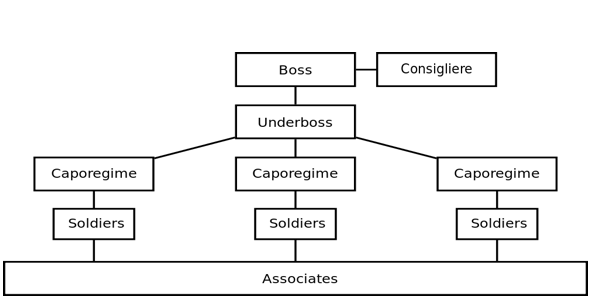
Hierarchical data visualizations indicate the ranking and order of various data and objects in a company or organization. For example, the tree graph with a simple linear path which allows data flow from left to right or top to bottom.
Other Hierarchical data plots consist of the following forms:
- Ring charts
- Tree-map charts
- Sunburst diagram graphs
- Circle Packing
- Dendrogram charts.
These data visualization forms are most useful where information has to be depicted in clusters.However, the complexity of these graphs when compared to others is the only backdrop.
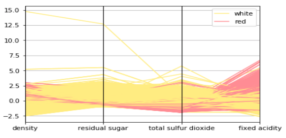
3. Network

Network data visualization allows users to demonstrate the link by connecting various data sets. Under this network, the users communicate through the intricate networks that link one data set to another.Few of the common types of network data visualization include –
- Alluvial diagram charts
- Node-link diagrams
- Network diagram charts
- Word cloud plots
- Non-ribbon chord diagram plots
- Parallel coordinates plot
- Matrix charts.
You can count on these visualizations whenever you want to elaborate the connection link between the data sets.
4. Multidimensional
As the name suggests, multidimensional data brings two or more elements under consideration. Multidimensional data visualization is usually known for the most attractive visuals because of the many intersecting layers and datasets.
Multidimensional data visualization consists of the following varieties
- Steam graphs
- Pie charts
- Scatter Plots
- Histograms
- Timetable charts
- Stacked area graphs
- Stacked bar graphs
- Multi-set bar charts
- Parallel sets
- Venn diagrams
The above-mentioned charts are the most beneficial as they can break down big data into their fundamental elements.
5. Geospatial

Geospatial data visualizations display information about physical areas. For instance, geospatial maps which depict regional maps with data marks. These maps are usually used to reveal information regarding sales or acquisitions that are made over a certain period of time. Moreover, they can be made visually appealing if they are properly colored coordinated.
Various geospatial visual data types include –
- Density plot
- Cartogram
- Dot distribution map
- Choropleth
- Heat map
- Flow map
- Connection map
Political campaigns and multinational corporations that want to showcase their market influence to the masses benefit the most from these maps.
Data Visualization Techniques
The process of representing visual data requires the following techniques to be followed properly that involves –
Know the audience
For every business whether small or large, it is necessary that the audience should be considered primarily. A chart prepared for a group of school students cannot be used for a group of college students and vice-versa. Therefore listing down the audience types and discussing it with your colleagues for further progress brings more proficiency and reliability to the project.
Emphasizing on relevant details according to the type of audience is utmost important. If the audience is new to data visualizations, demonstrate to them using traditional charts such as bar charts or pie charts. Simple or interactive charts can also be created according to the interest of the audience.
Right chart selection
For this, it is required to step back from the software program and create a rough draft or sketch on a paper. Share it with your colleagues and discuss further improvements. Create it on your computer and keep editing.If you’re not much familiar with data visualization then it is better to go for classics like bar or line chart. Progressively, you can try the lesser familiar chart types like bubble charts, dot plots etc.
Create a draft on a computer
The moment you have gathered the rough idea of your visualization, start creating a draft of your visualization on the computer. You can try various software programs based on your accordance.
Edit the draft
You have to do some hard work in editing your draft as their might be some unwanted things in it. Various software programs provide in-built borders, lines, and ink which can be unnecessary sometimes. So, examine each of those features and clean out those which do not have any purpose in your draft. Another thing that is manageable is outlining the shapes in white to match the background color and remove labels to avoid zigzags around the screen.
Use text to convey the message
Go for those fonts which match with the project’s branding instead of using traditional Microsoft’s fonts. Subtitles can be added to add a description. A two-line or three-line detail is considered to be perfect. Contextual details can be added using annotations with a two-line caption just below it. Check the size of various texts, for example – Headings should be large and information related to it should be comparatively smaller. Always remember to keep the size of those texts large that target audience the most.
Use colors to convey the message
Colors play an important role in enhancing the charts. They make the charts more attractive and appealing. Avoid using default colors from Google or Excel. Instead, use the color scheme of the chart. Preview your chart in grayscale instead of printing directly. Check the improvements required if necessary. Make sure the colors which have been used can be seen by those having color-vision deficiency. Use a dark or light contrast for the final message of the chain.
Examine the draft
Check the progress with different tests. Ask your colleagues to go through the draft and check for some changes or improvements. The best assessment would be the data visualization checklist where you can examine your draft properly.
Sharing the data visualization chart
This is the final step in which the chart designed is shared across various platforms to check if it can adapt their environment. These platforms can be presentations, webinars, handouts, and social media. However, before presenting the chart across different platforms, one needs to keep certain things in mind –
- If you’re presenting in a conference presentation or webinars, organize the chart into slides. A blue internet cord can be used for faster connection to run live webinars.
- A one-page handout is apt to target the audience with a clear picture of the message to be conveyed.
- In the case of social media, make sure the chart is in 2:1 aspect ratio. Overlapping the facts on photographs can also be done if necessary.
- Combine different charts to form a dashboard or an infographic. Dashboards are used for internal audiences for instance, the board of directors making decisions about the company. Infographic is used for the external audiences, for instance, to raise public awareness about a particular issue.
Why Data Visualization is Important?
Following are the reasons why people should go for data visualization:
Make complex data look simple
Data visualization techniques are useful in representing only that information which is essential for the target audience. For instance, pie charts can be used to depict the population of a particular region on the basis of age group.
Big to smart data
Data visualization techniques can be beneficial in breaking down big data and converting it into information sensible enough for the target audience. They can be used to explain complicated content in a simple manner.
Less time, more productivity
Data visualization techniques consume less amount of time as only relevant information is to be presented instead of the entire content. Consequently, this leads to an increase in productivity.
Online Data Visualization Tools
Following are some third-party online visualizations tools that are available for free to be used by everyone – However, for customized and advanced solutions, you can hire Tableau developer for tailored business insights.
- Tableau Public
- Tableau Gallery
- Microsoft Power BI
- Google Data Studio
- Openheatmap
- Leaflet
- Datawrapper
- Chartbuilder
The Future of Data Visualization
Data visualization is marking its entrance in the new era. It is advancing from art to science with the introduction of next-generation technologies and the evolution of apparent frameworks giving rise to new opportunities. Majority of data visualizations is two-dimensional. Neuroscientists are inventing ways to develop a five-dimensional model called a 5-D colorimetric technique.
It is also expected that with new up gradations working methods of the analysts will improve. They will answer the queries faster and look for more ways to grasp the data creatively. Hence, it is right to say that “Data Visualization” will be a brand ambassador of innovative data exploration. Connect with Intellectyx for Business Intelligence and Analytics Services in the USA


 Contact us
